Painting Forty Icons with an Image Model (and a Lot of Patience)
How every business icon in Ski Resort Empire was painted with Google's Gemini image model, why a magenta background and a shared style block matter, and the many ways an AI can misunderstand a ski lift.
I am a developer, not an illustrator. My first icons were hand-written SVGs: clean, flat and lifeless. On this day I tried something else: painting every business icon with an image model, one by one, in a consistent style. Spoiler: it worked, but not the way I expected.
The workflow
After a few failed attempts a clear process emerged:
- A shared style block. Every prompt starts with the same paragraph: painted casual mobile-game style, soft lighting, a slightly elevated three-quarter view, a small snow slab under the motif, no text, no frame.
- A short motif block per business: what it is and what makes it recognisable at 56 pixels.
- A reference image. Once one icon looked right (the hut), it was attached to the next prompts so the model kept the perspective, colours and outline thickness.
- A magenta background. The model paints on a flat, pure magenta. A small Python script keys out the magenta, cleans the anti-aliased edges, crops and scales the result to 256 pixels with a transparent background.
The prompts live in a markdown file next to the icons. When an icon needs to change months later, I do not have to remember how it was made.
What went wrong (a lot)
The most entertaining part of the day was the list of things the model got wrong. A selection of my own notes:
- The chairlift had one cable instead of two, then a chair that crashed into the pylon, then a hanger that was far too short. Lift mechanics are clearly not in the training data in the way a skier would expect.
- The restaurant "does not look like a restaurant in a ski area". The second attempt "looks like ancient Rome".
- The heli-skiing icon showed a mountain rescue helicopter.
- The ski rental "looks like a hospital".
- The luxury chalet came out in Victorian style.
- The shuttle bus looked like a private camper van; apart from the display above the windscreen, nothing said "ski".
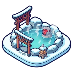
And one pleasant surprise: the onsen came with a snow monkey bathing in the hot spring, which is exactly the kind of detail I would never have thought of. It stayed.
Iteration is the real work
For a typical icon I needed three to six attempts. Sometimes a short edit prompt fixed a detail ("move the guest behind the counter"); sometimes it was faster to start over with a better motif description. A few icons are "good enough" rather than great and are on a list to repaint. That list is shorter than I feared.
The pleasant surprise of the day: all of it was possible with the free tier of the model. For a hobby project that makes the difference between "placeholder art forever" and a game that looks like a game.
From app to game
With painted icons in place, the rest of the interface suddenly looked like a business app. The second half of the day was about changing that:
- Cards with character. Business cards got an icy frame, a dark outline and small snow drifts on the top edge.
- Buttons with a lip. The blue buy buttons got a gloss and a darker bottom edge, like physical buttons. Orange outlines did not fit the winter palette and became blue.
- Snow in the progress bars. The bars are blue and snowflakes fall inside them, faster while a business runs and slowly while it is idle. My first idle version had all flakes on one line, which looked mechanical; now they drift naturally.
- A header that is a scene. The top of the screen became a mountain landscape with the wallet as a framed plaque, the snow crystal counter as a pill and round buttons.
- Round flags for the region tabs.
- A coin instead of a euro sign. The game's money is just money; real currency symbols belong to real purchases.
The UI icons (coin, crystal, settings, locks, boosts) were painted in the same style as the business icons, so everything belongs to one world.
Lessons
- Write the style down once and reuse it word for word.
- Ask for the background you can remove, not for transparency.
- Keep every prompt next to its asset.
- Judge icons at the size the player sees, not at full resolution. Many details that look nice large are just noise at 56 pixels.